
Two Whitefish Dining Destinations Glow with Striking Interiors
by JENNIFER WALTON
Restaurants play multifaceted roles in our lives. They enrich our experiences, encourage social connections, contribute to local economies, and celebrate the diversity and creativity of food and culture. They are more than just places to eat. When they require a redesign, their owners and interior designers play a crucial role in shaping their interior spaces’ ambiance, aesthetics, and functionality.
A seasoned interior designer knows that creating a visually appealing space that functions seamlessly, provides comfort to diners, and aligns with the restaurant’s brand is necessary to translate the concept and vision into a well-designed interior.
Visitors often choose restaurants based on first impressions. Usually, that begins with online sources, but it’s from the moment they step inside—they’re seeking to connect with the local culture and cultivate a meaningful appreciation for the sense of place, menu, and a feeling of belonging. They want a restaurant where ingredients are locally sourced, where specialties define the region, and where energy complements their discovery, where laughter and libations sit side by side. Alternatively, locals wish for a destination that speaks to their locality—brimming with the familiar, the opportunity to socialize, and an immersive setting that brings them closer to their community for impromptu gatherings and special occasions.
Two recent restaurant remodels in downtown Whitefish focused on retaining history while also establishing new brand stories during their transformations with innovative designs that capture the simplicity and sensory experiences of dining. They offer an inviting, familial atmosphere, whether it’s for a craft cocktail, multi-course meal, musical event, or a grand celebration—the curated interiors, aside from the culinary excellence, leave a lasting impression and a desire to return.
Beginning the process of a restaurant redesign is exciting and immersive. As the restaurant owners discussed their concepts with Payne/Cole and Hunter & Company Interior Design, respectively, they expressed the cultural and visual narrative of Whitefish and its environs while considering its spirit and stunning landscapes. They furthered the discussion with considerations for a compelling blend of traditional, contemporary, and mountain-themed master plans that exemplified texture and timeliness.
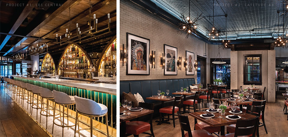
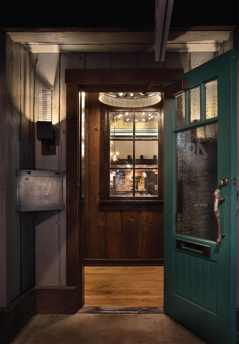
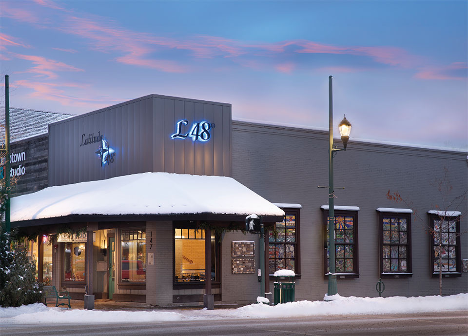
Here’s what happened when Payne Cole Designs and its owners imprinted their design expertise into 101 Central, a 106-year-old building on the corner of First and Central with a history to match its location, which includes the restaurant, Herb & Omni, and an event space, The Second Story. One block south, on Second and Central, sits Latitude 48, whose space received a major remodel from Hunter & Company Interior Design and whose exterior is widely recognized by its windows of community art.
Both establishments used the power of materials, warm and rich color palettes paired with a thoughtful curation of textiles, lighting, and furniture, to add complexity to their spaces. And finally, they considered elements faithful to Montana.
A successful restaurant identity is authentic, consistent, and resonates with its audience. It evokes a particular emotion that its guests associate with, ultimately leading to loyalty, positive word-of-mouth recommendations, and a yearning to return to those moments of connection and contentment because it’s about coming home to a place that holds a piece of your heart.
Project #1: 101 Central
101 Central Presents:
A Whitefish Dining and Entertainment Experience from Payne Cole Designs
“This is a beautiful building with a lot of brick and original wood—there were things I wanted to keep to honor its history.”
–Jamie Goguen, 101 Central
In 1967, the first building in Whitefish, the Sprague Saloon, originally built in 1905, was renamed Casey’s—a bar with an Irish twist. In 2011, philanthropist and venture capitalist Michael Goguen purchased the ailing building and rebuilt it in its original footprint. Fast forward to the post-COVID era, Michael and his wife, Jamie Goguen, the founder of The Juice Standard, the first all-organic cold-pressed juice bar in Las Vegas, decided to repurpose the bones to suit modern-day needs. Whitefish, now more popular and populated than ever, was in dire need of places for people to do what they’ve been doing since the dawn of time: break bread together. Now renamed 101 Central, its address since 1905, their vision of Herb & Omni, a one-level restaurant with a spectacular bar, and The Second Story, an upgraded entertainment-cocktail lounge, became their magnificent mission with expertise from the accomplished architectural firm Payne Cole Designs.
The vision was enhanced by the couple’s extensive international travel, appreciation for exceptional food, and love of entertainment, which all became the impetus for a complete metamorphosis and a new chapter in American fine dining in the Mountain West. With internationally-recognized executive chef Justin Kingsley Hall as the culinary luminary, the purpose is “to serve the modern tourist and steadfast local alike, both of whom value authenticity, familiarity, and a damn good night out,” and that exemplifies the ambition, energy, and superlative style within 101 Central, which houses the restaurant, Herb & Omni, the upstairs lounge, The Second Story, and above, Whitefish’s largest rooftop bar (opening in spring 2024).
But let’s begin with the infrastructure and discipline required to bring about a total reinvention. “In 2011, this structure was sitting on dirt, there was no foundation, and the city had condemned the second story 20 years prior. Our only option was to take it down, remove it, and build something much better. Ten years later, understanding the demand and upgrading the infrastructure, it is designed now for the purpose for which it is being used. They didn’t need to go to the extent they did, but they did, and the results are stunning,” Eric Payne says. “This is a beautiful building with a lot of brick and original wood— there were things I wanted to keep to honor its history,” states Jamie Goguen.
And that’s where the excitement builds because, as Goguen adds, “We are working on making it a five-star experience. It represents our combined values. What is the best thing people do together? Eat and drink. I think every founder of any company who has boiled down their highest values, implements those values into business, service, or product, and then shares those values—people will resonate with them. I love restaurants and live entertainment, and that’s what this is all about.”
The Multi-Hyphenate Experience: Cocktails + Dinner + Supper Club
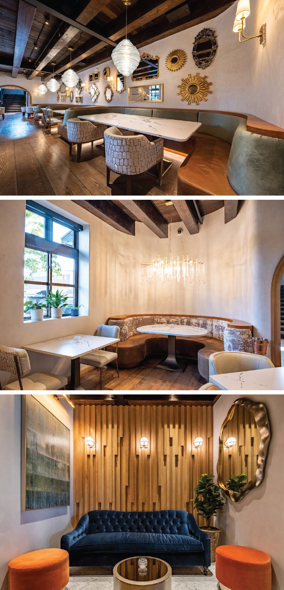
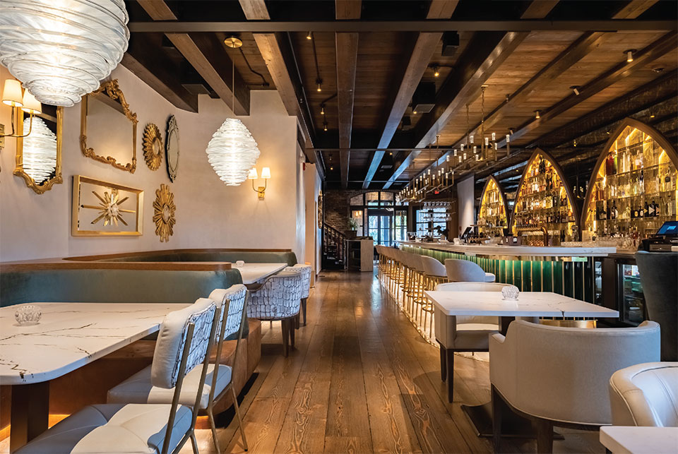
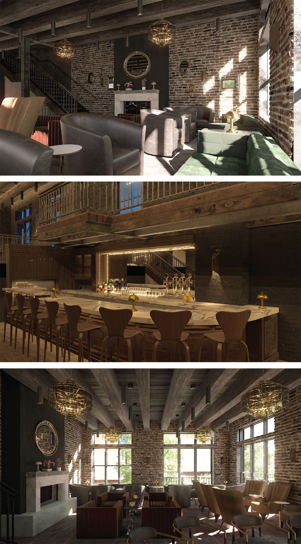
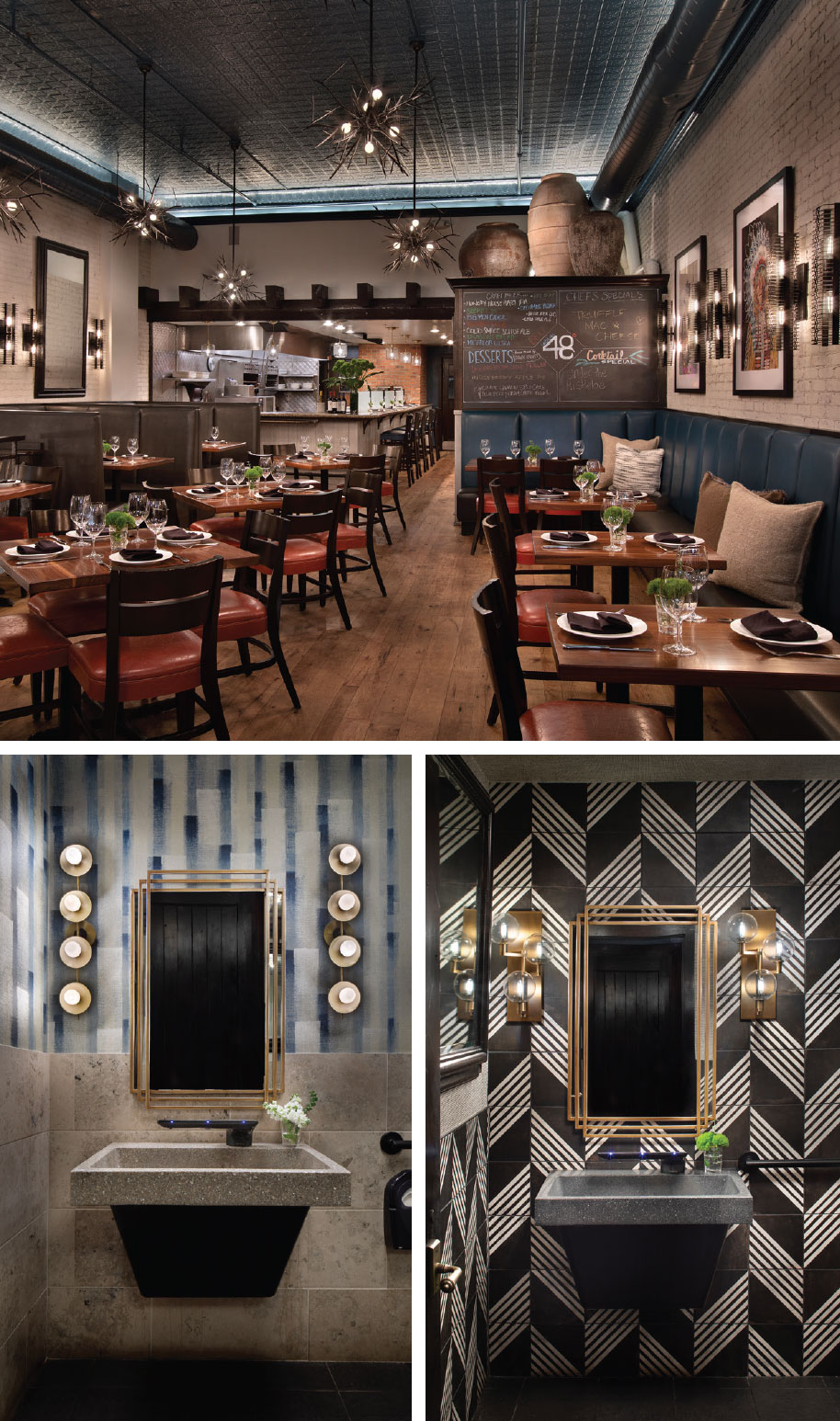
The restaurant, with a name that values herbivores and omnivores, signifies the chef’s expertise in menu design and his pioneering role in shaping modern cuisine in Whitefish. That aesthetic represents nature’s symbiotic relationship, which translates from the locally sourced ingredients to the restaurant’s interiors with the lush and glowy colors of nature paired with an exquisite curation of custom lighting (glass beehive-inspired fixtures), flooring (repurposed and reclaimed), a curated collection of mirrors, and innovative metal creations from Acutech Metalworks (in Columbia Falls), who crafted brass throughout the main dining area and bar.
The polished brass embellishes the opulent bar as it contrasts with the dominant Kelly green tile (an homage to Casey’s) below the ivory marble countertop. The Restoration Hardware chandeliers, white leather bar stools, and an impressive selection of spirits displayed within the amber- shaped arches pay reverence to beehives. Jamie, who studied permaculture in college, became fascinated with honeybee culture from an etymology teacher. She subsequently featured her love for them in various elements throughout the space, most notably in the main dining room and “The Cove,” where a linear chandelier resembles honey dripping off its branches.
Then there’s the masterful blend of accent, indirect, and mood lighting, everything custom from CT Lighting in Denver, which defines the unique deep honey-colored glow—as Goguen remarks, “the warm glow that is good for the spirit, especially in winter.” The effect is that you are somewhere that suits you and you’ve known, that feels comforting and inviting, yet with its master craftsmanship, it is the perfect union of glamour, refinement, and the promise of good times!
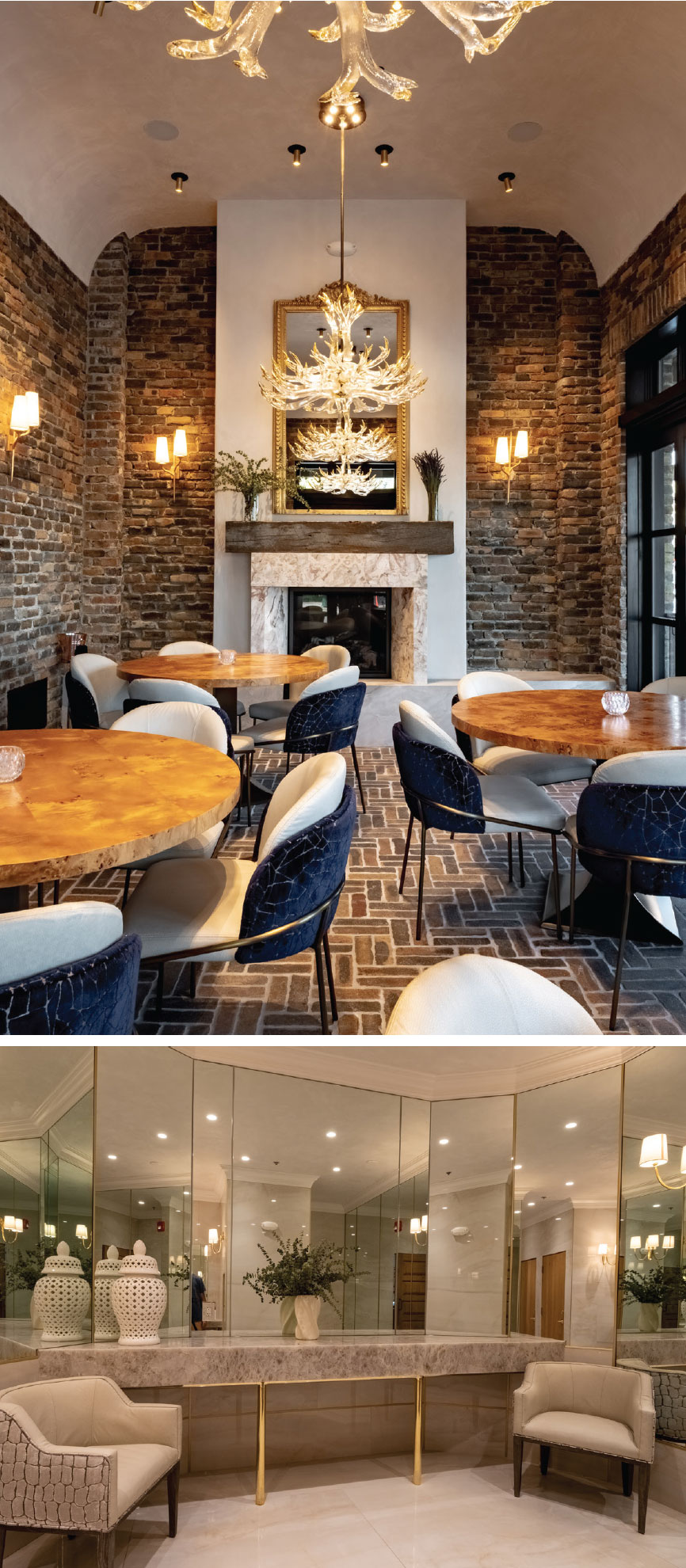
But the first thing that strikes is the scene from the street—the vision of a fireplace, glittering glass elk-inspired chandeliers, brick floors, and ivory-plastered walls that add a layer of curiosity and symbolize the feeling “that you’ve been invited into a friend’s home,” adds Goguen. Local artist Mallory Dawn’s “Forest Angel,” a painting of a doe peeking from within the woods, hangs in the room, and its hues of periwinkle, teal, blue, and green tie subtly into the interior’s irresistible sense of wilderness.
Like Goguen, Payne is always mindful of the sensory experience; he adds, “These colors are from nature, and 100% Montana,” and although the lighting, textures, and their applications brought a sense of warmth and cleanliness and were pivotal in the design concept, it’s the distillation of all the design elements that perform so well together that intensifies the whole.
And that specificity extends to the women’s lounge and men’s restroom. Blissfully spacious and in shades of cream with a dash of taupe, the women’s lounge is sophisticated and more than functional; it’s an extension of the thoughtfulness of necessity. “I wanted full-length mirrors, a luxurious place to go nurse or bottle-feed, with a changing table, a place to take a moment!” says Goguen. Alternatively, the men’s lounge, with its black marble and tiles, black urinals, and stainless- steel baby changing station, is masculine and meticulous. Daddy’s duties need not be dreadful; instead, they ensure a well-defined space that meets a family’s evolving needs.
“Then there’s the masterful blend of accent, indirect, and mood lighting, which defines the unique deep honey-colored glow—as Goguen remarks, “the warm glow that is good for the spirit, especially in winter.”
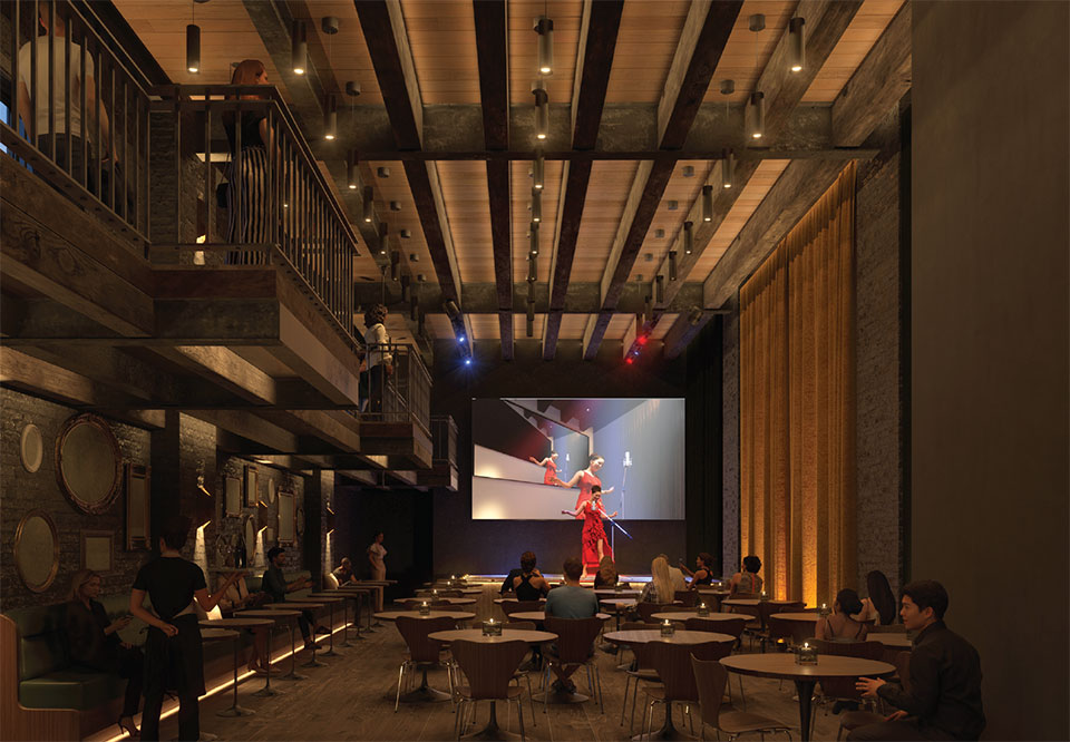
The Second Story
“What I envisioned was more of a cocktail lounge with tables for two to four chairs—I drew my reference and inspiration from the restaurant Delilah. I wanted to convey that feeling of an old-school supper club—when you look around and see your neighbors and have that shared experience, whether from a night of jazz, a Fleetwood Mac cover band, comedy, or our in-house Second Story band,” Goguen shares. It’s a place where you can escape the outside world and immerse yourself in the ambiance, all while feeling like you are part of something memorable. “The bones are stunning. We added a fireplace and extended the stage for a five-to-six-piece band to include a baby grand piano,” she adds. It’s another destination that pledges its allegiance to a night well-lived.
Yearning to return to a restaurant and cocktail lounge is a sentiment filled with anticipation and nostalgia, driven by the memories of past experiences and the desire for a future visit. Various factors can trigger this feeling, which is why Herb & Omni and The Second Story are worthy of greatness. The combination of talent from the Goguens, Payne Cole Designs, and Kingsley Hall makes 101 Central a triumph in a town where cowboys, concierges, city-slickers, and conservationists can share joint interests over creative cocktails, cheese plates, caviar with tots, hay-roasted chicken, among other tantalizing dishes.
“You can be at home and make your favorite drink or come down to 101 Central, feel at home, and we’ll make your favorite drink at Herb & Omni,” says Goguen.
To make a reservation, visit opentable.com
*101 Central actively participates in the community by hosting fundraisers and supporting local initiatives. It’s slated to become a cherished hub for fostering connections and celebrating the spirit of togetherness.
“I wanted to convey that feeling of an old-school supper club—when you look around and see your neighbors and have that shared experience, whether from a night of jazz, a Fleetwood Mac cover band, comedy, or our in-house Second Story band.”
–Jamie Goguen, 101 Central
Project #2: Latitude 48
Crafting Culinary Ambiance:
The Remarkable Transformation of Latitude 48 Bistro & its Red Room Lounge by Hunter & Company Interior Design
“We wanted to stay true to the roots of the town, and retain the Western vernacular, but inject more modern colors to create its spirit.”
–Kay Crnkovich Sherman, Hunter & Company Interior Design
Latitude 48 Bistro, aptly named for its latitudinal coordinates, underwent a significant rejuvenation under the direction of Hunter & Company Interior Design, and the result has brought new life to a beloved dining establishment.
In the ever-involving world of hospitality, a restaurant’s interior design can be the difference between a one-time visit and a loyal following. Restaurant interior design is the art of composing an ideal background for developing an engaging story. Latitude 48’s story is well-known for its contemporary and traditional menu, strengthened by local and regional ingredients, imaginative cocktails, an impressive wine list, and robust seasonal audiences. However, there was a need for change, and after being stripped to the basics, the designers discovered sources and initiated applications that guided their redesign process.
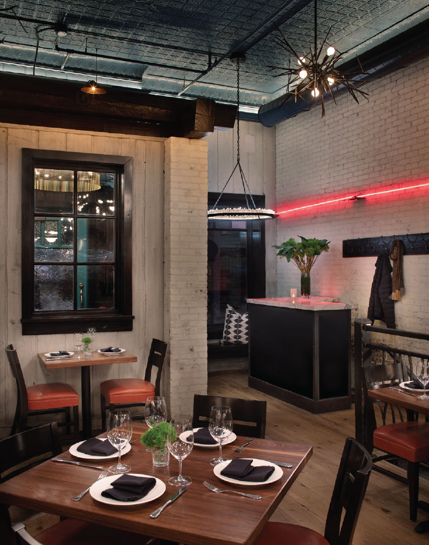
To craft the refreshing atmosphere, the lighting, color palette, and materials defined the transformation. Previously, the restaurant leaned toward a darker ambiance, but Hunter Dominick and Kay Crnkovich Sherman, along with the rest of the Hunter & Company team, knew that the solution to its reinvention lay in lightening up the entire space, beginning with painting the antique tin ceiling a blue green to keep the antique look but to give it a refresh. From there, the original brick walls, as well as the wood elements, received a lustrous white paint. “We wanted to stay true to the roots of the town, and retain the Western vernacular, but inject more modern colors to create its spirit,” says Crnkovich Sherman.
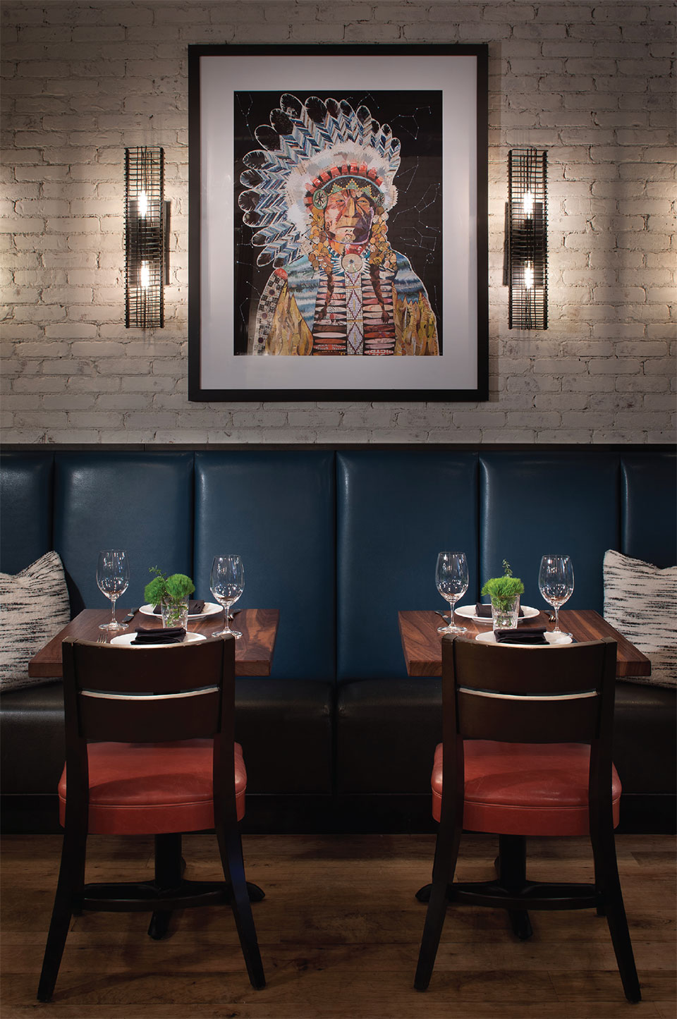
From this blank canvas, the story began to develop. The team understood that an homage to cultural familiarity and the concepts needed to maintain high aesthetic levels and character would set it apart from the competition. The idea of a vibrant place that welcomes visitors and locals is decided through every detail, from the choice of materials to accessorizing the tables. Collaboration from the team allowed everything from custom lighting, furniture, and seating to local art, acoustics, and unisex bathrooms to make a statement that identifies Latitude 48 as a formidable centerpiece of the community.
The restaurant’s layout utilizes strategic seating arrangements to instill the illusion of intimacy while encouraging a communal experience. Seating extends back to the bar area near the exhibition kitchen and pizza oven, where the brick would remain in its original state “as a nod to the historic building.” says Crnkovich Sherman.
The amiable hum of a great night begins at the entrance. The painted turquoise green front door accented by a Rocky Mountain Hardware brass branch pull provides an organic warmth. Once inside, the glow from the Hunter & Company’s showroom Round Halo chandeliers at the dining nook and host reception assures intimacy and inclusivity. Once seated, Arteriors Natural Iron chandeliers strategically light the main seating area, and the vertical wall sconces accentuate the framed art.
Hospitality industry veterans harness the power of color to evoke emotions and influence appetites, knowing that colors can set the mood and influence behavior. Restaurant design that embraces color leads to a dynamic yet playful approach to dining. Hunter & Company chose a blue leather for the banquette seating and cinnamon for the chairs. The bold hues promote a sense of balance, unity, and sophistication. These choices align well with the cuisine—the delectable elk tenderloin with herb-roasted fingerlings, broccolini, oyster mushrooms with a huckleberry demi-glace, and the tasty trio salato pizza with pepperoni, spicy sausage, bacon, asiago, parmesan, and mozzarella, and the delicious Tuscan kale Caesar salad.
The restaurant’s layout utilizes strategic seating arrangements to instill the illusion of intimacy while encouraging a communal experience. Seating extends back to the bar area near the exhibition kitchen and pizza oven, where the brick would remain in its original state “as a nod to the historic building,” says Crnkovich Sherman.
The interior design is a mix of traditional and modern elements. It features many elements made from reclaimed materials, making the overall design stylish and sustainable. In addition, it’s a culmination of the details that matter—like artwork that personalizes the space and weaves the brand’s identity, the neon’s exterior and interior use, the original wide plank flooring (which benefits the acoustics), and the high-end boutique-style bathrooms.
One of the bathroom’s has a pretty-as-they-come vertical patterned wallpaper heightening the room. The predominant shade is a soft powder blue that covers most of the walls, giving the room a calming ambiance. The blue shades evoke a sense of tranquility and cleanliness, making it a perfect choice for a bathroom setting, and the effect is one of femininity. The flattering lighting feels more residential than commercial.
The second bathroom is designed with a bold and masculine aesthetic. It features a striking black-and-white tile scheme artfully arranged to create a visually stimulating environment that exudes strength with a slice of modernity. The design team took advantage of the Bradley WashBar, which provides a touchless handwashing experience (because it houses soap, water, and a dryer in one intuitive unit) and vanity lighting from Visual Comfort in both bathrooms.
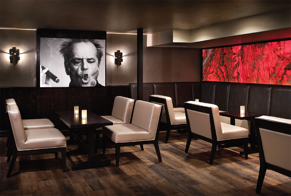
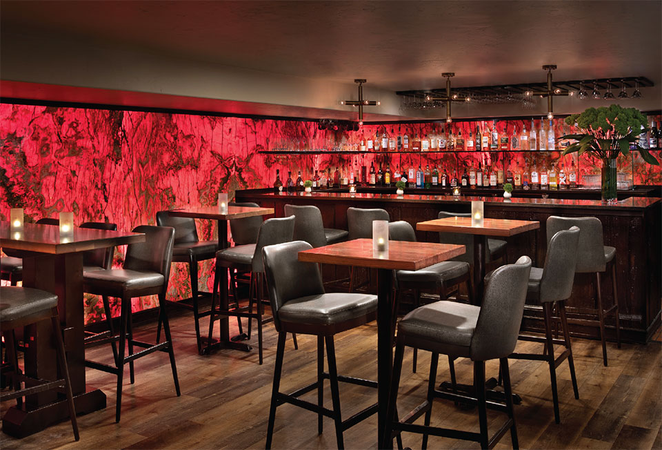
After sips and snacks at the bar or dinner in the main room, the obvious and effortless destination is downstairs in the Red Room Lounge, where red is the main ingredient. Red is considered emotional and energetic due to its physiological effects and ability to evoke many emotions. It captures attention, making it a powerful and impactful color in various contexts, and the use of it in the space is exciting. “The color, lighting, and the design were purposeful—we wanted a space that made it feel exciting to go downstairs and spend time with friends, listening to music (often live), enjoy a cocktail and settle into the mood of the night—it was designed to be a sophisticated and immersive experience,” says Crnkovich Sherman.
The effect of backlit onyx LED panels and a trio of geometric fixtures over the bar that glimmer upon the inch-thick suspended glass shelving so guests have the whole experience of the onyx pattern and veining through the bottles and glassware gives the sensation of settling into a private glamourous club—especially with the iconic image of Jack Nicholson as a member.
The low-profile pearl and high-top pewter upholstered chairs add to the luminosity of the aesthetic and combine well with the wood flooring. “What’s fun about this space is that it’s easy to rearrange the seating into multiple zones to accommodate whatever the client wants,” adds Crnkovich Sherman.
“What’s fun about this space is that it’s easy to rearrange the seating into multiple zones to accommodate whatever the client wants.”
–Kay Crnkovich Sherman
Hunter & Company and Latitude 48 know that memories linger long after the last sip of wine. Whether you’ve savored delectable dishes, lost yourself in the rhythms of the alluring lounge, or shared laughter with friends, know that this space is your place, where unforgettable moments come to life.
“We wanted a space that made it feel exciting to go downstairs and spend time with friends, listening to music, enjoy a cocktail and settle into the mood of the night—it was designed to be a sophisticated and immersive experience.”
–Kay Crnkovich Sherman, Hunter & Company Interior Design